The Beneventan Memory
The first part of this article was originally written for Communication Arts magazine, and published in their May/June 2007 issue. It has been lightly revised, and provided with new illustrations.
1. The Typography of Forgetting #
Thoughts about the relationship between writing and memory have always been ambivalent, infected by the fear that all writing is, in some sense, a kind of forgetting. At the end of Plato’s Phaedrus dialogue, Socrates relates the story of the ibis-headed Egyptian god Theuth, keeper of magic and ritual, who one day invents a new kind of magic: writing. Theuth proudly presents his new invention to king Thutmose of Thebes, extolling its usefulness and claiming, ‘It will make the Egyptians wiser and better able to remember things; for it has been invented as an aid to memory and for wisdom.’ But the king (in the complex familial relations of Egyptian royalty and divinity, he is also Theuth’s son) is not convinced; indeed, he suspects that the opposite is true, and that writing
…will create forgetfulness in men’s souls, because they will not use their memories but will trust to the external written characters and so cease to remember. The art which you have discovered is not a means of remembering but of recording, and you give to your students not wisdom but the appearance of wisdom. They will take in much yet learn nothing, will think they know everything, and will be tiresome to deal with because they have the show of wisdom without the reality.
Socrates expands on this theme, eventually contrasting writing’s static simulation of knowledge with the vigorous, animated ‘living word’ of speech and, especially, dialogue. For Socrates, the important thing is not to record ideas, but to talk about them. It is Thutmose’s first comment, though, that expresses the primal worry about writing. It is not what the god claims. It will not help us remember but will make us forget.
When an oral culture becomes a literary culture—a profound societal transformation that occurs even today, in the experience of small linguistic communities living out their humanity beyond the reach and concerns of ‘global communication’—it is said to be ‘reduced to writing’. This phrase captures the ironic cultural simplification that occurs in the transition to what we think of as a more sophisticated (modern, progressive) medium: the reduction of diversity and the restriction of potentialities. In any major media shift, it seems, only some dominant streams of earlier cultural expression make the transition to new media. Much gets left behind and, perhaps most significantly, this includes many possible ways of making new things. Of course, the new medium replaces some of these possibilities with new creative potencies of its own, but often these are developed along narrower lines. A story in an oral culture is an exchangeable currency, passed from teller to teller, each bringing a particular emphasis, or articulation, to the performance of the tale, adding to it from his or her individual and cultural experience. The same story written down becomes a ‘text’—perhaps one of a number of recorded versions of the story—that has been reduced to writing and has lost much of its potentiality for further development. It will be read, may be admired or loved, but each reading is an act of forgetting all the other versions of the story; those that were not written down and those that will never be spoken.
Is this kind of cultural forgetting characteristic of all media shifts? Something similar seems to happen in the transition from manuscript to print, from a culture in which texts are written by hand—chirographical—to one in which they have become typographical. From its earliest days, printing from moveable type has been a commercial venture, the economics of which meant that no book would be published in print that would not be guaranteed to sell a few hundred copies. Many works that were simply not fashionable at the time of the transition, or that were considered too esoteric, would not be printed. Others, which might have been safely passed around in manuscript, would have been too dangerous to publish and distribute in print. An enormous number of texts that existed in manuscript, simply failed to make the transition to the new typographic medium; they were forgotten. The new medium acts as a kind of filter, through which only some knowledge of the past passes. Of course, unlike the stories of oral cultures that died with the last people who knew them and spoke them, there is the chance that the wealth of human wisdom, wit and insight that typography has enabled us to forget may be rediscovered in the fragile pages of surviving manuscripts.
Recently, I’ve begun to think about how this notion of ‘reduction’ applies not only to the ideas and texts of the past, but also to the letters in which they were written. The reduction of a script to typography acts as a filter on letterforms in much the same way as typographic reproduction of texts acts as a filter on knowledge. The greatest reduction is probably in the loss of much regional variation in letterforms, the local dialects of script. In the second half of the fifteenth century, the multitude of regional styles was reduced to two principal models: the humanist book hand and the textura blackletter. Both these styles, in their new typographic medium, then underwent refinement and development into new derivative and supplementary styles, leading ultimately to the rich typographic diversity of the present day. The new creative potencies of typographic expression are undeniable, but looking through paleographic studies of the Armenian, Greek, Hebrew and Latin scripts, I’m struck by the number of possible lines of descent that are typically cut off when a script is reduced to typography. It is like looking at a family tree in which most of the siblings of a generation die without children, and only one or two branches continue.
The Beneventan script is a good example of a forgotten writing style that, had the accidents of history been a little different, might easily have become the model of our basic typographic letterforms. This round, undulating writing style, with wide, alpha-like lowercase a, originated in the scriptorium of the great Benedictine monastery at Monte Cassino, south of Rome. Today, it is known only to scholars and specialists dealing with historical documents,1 but for more than five hundred years it was one of the major regional writing styles. By the time of the transition to type, the popularity of the Beneventan script was already on the decline. Like certain books that had once been popular in manuscript, it had ceased to be fashionable in the places that mattered, the centres of humanistic learning in Rome, Florence, and Venice that were the major market for the new printed books.
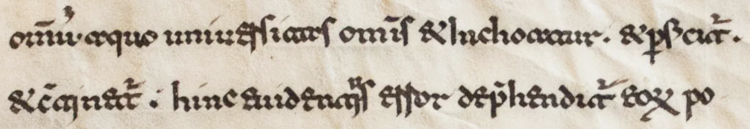
Fragment of a Beneventan manuscript on vellum, written at Monte Cassino. [DMMapp Blog]
In the early 1990s, Robert Norton, then head of the typography group at Microsoft, wrote to his many friends and contacts in the type business—type designers and typesetters, graphic designers, publishers and editors—and invited them to nominate, with comments, which typefaces they most valued and which they most felt the world could do without. The results were published by Norton in the entertaining and cleverly reversible volume Types Best Remembered/Types Best Forgotten.2 [Since the selections in each side of the book are ordered alphabetically by typeface names, there are helpful indices of ‘who remembered’ and ‘who forgot’.]
The contributions of the Dutch teacher and theorist Gerrit Noordzij are characteristically provocative. He is the only contributor to nominate one of his own typeface designs as best remembered, and the only contributor to suggest that all typefaces are best forgotten. (Only Alan Fletcher comes close to the same conclusion with his handwritten contribution ‘A typeface is an alphabet in a straightjacket.’) Noordzij wants us to forget all typefaces, but fundamentally his comments are positive ones, reminding us of the relatively brief amount of time that
…type has paralysed the faces of writing. Their mummified bodies are laid out in the catalogues of the typefounders. A stop of 500 years in the development of text scripts is long enough to make one look upon formal writing as static. Against a tradition of 5,000 years, however, the interruption has been merely incidental.
Perhaps so, but we now live in a society in which the majority of people do not write, and certainly do not write formally. Ironically, the only medium in which the broad potential persists for new styles of text script—lettering intended for continuous reading—is typography. This is not true of all societies: there are still places in the world where a scribal tradition is maintained alongside modern communication media, and where creative exchange or collaboration between writing master and type designer is possible, if they are not too suspicious of each other. But for us, if we want to rediscover some of those lines of descent, those potentialities for new forms cut off by the reduction to typography, the only significant cultural framework within which to do so is type itself.
Noordzij recognizes this. Writing in the context of the ferment of typographical experiment and playfulness of the early 1990s—much of it now itself forgotten, much of it forgettable—he notes:
From a traditional typographic point of view type design is drifting. But it is only the provisional standard that has fallen away … We are only recently beginning to see the new opportunities for type design.
It is disorienting to think of the centuries-old, well-established letterforms of our typographic alphabet—the letterforms of Aldus and Garamond, of Caslon and Bodoni—as a ‘provisional standard’. But perhaps it only seems to because we have forgotten so much that preceded them, and have forgotten other ways of thinking about letters.
Noordzij picked up on the potential in the democratisation of font manufacture: the new opportunities that arrived with the reduction of the material costs of font development and the availability of tools to make digital fonts. The media shift we are currently engaged in, seems to me different in important aspects from the transition from orality to literacy or from manuscript to print. Previous media are not being swept away, they are being recorded, augmented and broadened by the Internet. If other media shifts have acted as filters on our knowledge of the past, the Internet is acting as a diffuser, and providing a forum for people around the world to share enthusiasm for gradually rediscovered artifacts of a forgotten past.
The global diffusion of the fragments of that past can lead to unexpected developments. In researching this article, I stumbled across a new font in that forgotten style of medieval Italian writing: Agedage Beneventan, designed in Nagoya, Japan, by Ryoichi Tsunekawa.

Agedage Beneventan, designed by Ryoichi Tsunekawa, Dharma Type.
This is no mere scan and trace of samples from a paleographic text, but a serious effort to represent this venerable script in a fresh typographic idiom. It is also an act of remembering, by a designer from another culture, picking up a fragment of the European past and giving form to the memory of it.
Postscript to Part 1. #
Subsequent to the original publication of this text in Communication Arts, and while I was preparing materials for the workshop presented in Part 2, I discovered another digital Beneventan font, Cal Beneventan Minuscule, designed by Lazar Dimitrijević at Posterizer KG, Serbia. While Tsunekawa’s Agedage Beneventan is a freer interpretation of the script—lighter and smoother than most manuscript examples—, Dimitrijević’s is a more faithful representation of the historical models, and includes a substantial set of variants, ligatures, and scribal contractions.

Cal Beneventan Minuscule ligatures and contractions, designed by Lazar Dimitrijević, Posterizer KG.
2. The Beneventan Typecooker #
TypeCooker is a human intelligence prompt generator, developed by Erik van Blokland. With various levels of challenge from Starter to Pro, it generates recipes of random characteristics to be applied to the design of letterforms. Each time the TypeCooker page is refreshed, it presents a new recipe, e.g.
- width extended
- contrast amount low
- contrast type expansion
- construction roman
- weight bold
- stroke endings straight, no serif
This is the output of an ‘Easy’ setting; more advanced settings add more characteristics such as ascender/descender length, stem shape, intended usage, and even technical implementation such as specific variable design axes.
Erik calls TypeCooker a ‘simple exercise generator for those interested in type design and lettering’. It encourages the practice of sketching and thinking about design solutions in the absence of other sources of inspiration, and has proven very useful in a teaching environment.
In 2018, on one of my irregular visits to the University of Reading’s Department of Typography and Graphic Communications, I conducted a workshop with a small group of MATD students under the title The Beneventan Typecooker. The workshop began with a short lecture and handouts introducing the Beneventan script and its historical and geographical context, then posed the question ‘How might Beneventan letterforms have evolved if they had undergone multiple centuries of typographic development?’ Or, to ask the question another way, how might various styles of typography look if Beneventan, rather than the northern Italian humanist hand, had provided the primary model in an alternative history?
Given the short timeframe of the workshop—two days, with some of the students only able to participate on the second day—, I was inspired to have the participants use TypeCooker to generate characteristics to incorporate into their imagined typographic descendants of Beneventan script. This was not without caveats: some of the characteristics that TypeCooker will suggest are themselves evolved conventions of Latin typography derived from humanist script, notably the notion of italic and the bicameral alphabet of upper- and lowercase letters, neither of which are obvious paths for Beneventan to have taken in our alternative history.
When dreaming up ideas for new workshops, I always wonder whether they’ll make as much sense to the students as they do in my head, and whether it’s an appropriate time of the academic year to introduce certain ideas. So it was very rewarding to see how quickly the students got to grips with the project, the sensible approaches they took to familiarising themselves with the Beneventan letterforms, and the speed with which they were able to start interpreting these forms in different styles. It was great to see the enthusiasm, and I was especially pleased that those who were only able to attend on the second day threw themselves into the project and were given helpful advice from the students who had worked at it from the beginning.
I encouraged the students to consider the workshop in the broader context of their studies at Reading, and not simply as an engagement with an historical curiosity. There are things to be learned from the exercise of translating an older European manuscript style into type, which can be applied to the design of typefaces for other writing systems that exist only in manuscript or with very limited stylistic variation, whose principal source of models and inspiration are found in handwritten texts. The workshop compressed into two days a process that has taken place repeatedly around the world, whenever writing reduced to typography.

The Beneventan alphabet from a manuscript exemplar and, below, Kevin King’s interpretation of the letterforms in his workshop project. Note the very similar ductus of the a and t, and the distinctive shape of the k.
Some of the challenges the students faced resulted from the TypeCooker prompts, and some are inherent in the Beneventan script. Some letters of modern alphabets are unattested in the southern Italian Latin manuscripts, so needed to be interpreted with the general styles of those models, and then extrapolated to the target typographic styles. All the students grappled, for example, with the peculiarly similar ductus of the a and t in Beneventan writing, and considered if these letters might have diverged in typography, and become more legibly distinct?
The following sections are based on the feedback I provided to the students at the time, which I have not significantly edited for publication, preferring to maintain something of the immediacy of the workshop. I hope the critique notes encourage readers to look closely at the samples, and to find therein things to interest and delight. Please bear in mind that these are workshop projects, not completed typefaces.
Kevin King #
Kevin joined the workshop on the second day, but I am introducing his ‘Nursia’ project first because it is closest to the historical sources. Although my initial thought was that all the students would be interpreting the script in ways that departed considerably from the late mediaeval models, Kevin’s project is an interesting exercise in imagining oneself as the first person to reduce a script to typography, going through the process of deciding what features to regularise, whether and how conventionally ligated sequences should be presented as individuated characters, and so forth.

Specimens of Kevin’s design, showing the effect of the standard and variant e shape.
There are some dark spots in text, mostly around the letter r. It would be good to work out ways in which the knot formed by the ductus of this letter can be optically adjusted to produce a more consistent texture. Given more time, it would be useful to explore the relationships of f r and s, and ways in which these could be resolved, as well as working more on the spacing and proportions to see if a more rhythmic pattern might be achieved (cf. studies by Peter Burnhill and Frank Blokland on renaissance font metrics, which provide interesting insights into quantisation as a foundational aspect of typographic text production). I’m glad Kevin didn’t try to resolve the a vs t legibility issues by radically departing from the manuscript ductus, which would have seemed out of place in this particular historical re-imagining: something must be left for the following centuries to work out. I don’t think the variant e is entirely successful, although I understand the impulse to try to simplify this letter; it suggests a possible direction of evolution.
Dominic Stanley #
Dominic’s ‘italic’ Beneventan seems to me one of the more difficult challenges to emerge from the TypeCooker recipes. It requires not one, but really three historical speculations: the evolution of a more cursive way of writing the Beneventan letters, the reduction of that cursive style to typographic regularity, and the standardisation of a typographic distinction based on slant. The last of these is an artificial constraint, of course, because it emerged in roman/italic typography from specific models of formal/informal humanist script. I think Dominic would have been justified in approaching the challenge in a different way: asking what might constitute ‘italic’ in the sense of a distinctive, secondary style of Beneventan typographic articulation, rather than assuming that it means horizontal compression and slant (this is a useful thought to keep in mind when considering the typography of scripts without a direct parallel to italic).

Dominic’s challenging Beneventan ‘italic’: an excercise in taming a complex texture.
That said, I am glad Dominic subjected himself to the difficulties of exploring what happens to shapes that have evolved in an upright, formal manuscript hand when they need to be slanted. As he discovered, there can be difficulties in achieving an optical consistency in the angle of slant, and different kinds of interaction and spacing issues emerge. The resulting texture may easily become overly busy.
Allowing the horizontal bar of the e to sit below the x‑height seems to me a good decision given the short-ascender aspect of the Typecooker recipe. I think the d would benefit from the same kind of treatment, with a slightly shorter bowl allowing for a more obvious ascender. In this design, there would be some justification in finding a way to differentiate the construction of a and t, since each could evolve its own cursive ductus.
Tamara Pilz #
I think we can say with certainty that Tamara’s project is the world’s first Beneventan variable font. I’m really glad she saw the opportunity for this, and did the extra work to implement it. Her workshop deliverables included an animation of the font transitioning from narrow to wide, revealing good decision making in management of white space within and around the letters, especially for d and e.

Narrow and wide masters of Tamara’s light, cursive design.
The interpretation of the Beneventan ductus that results in so many hooked strokes in this light-weight design presents challenges similar to Dominic’s with regard to achieving a consistant optical angle. The v and w lean a little too much to the right, and the the right-side stroke could be bowed more to compensate. Conversely, the a d and t seem to push towards the left, especially in the narrow master, so perhaps a solution would be to introduce a slight rightward lean in these and other round forms.
I like the structure of the f very much, but it gets a little dark relative to the other letters. The simplified structure of the r works graphically within the style, but I didn’t immediately read it as r so I wonder if it is too far removed from the original ductus? The stronger differentiation of a versus t is nicely achieved in this design, using both structure and width to improve legibility. Overall, the simplification of forms works well, especially the e.
Sérgio Martins #
Sérgio’s ‘Slabaventan’ is interesting as an example how something that is close in weight to many manuscript examples produces a similar texture even when involving significant differences in treatment of counters and terminals. There’s a nice woodcut feel to Sérgio’s shapes.

Sérgio’s pleasingly rugged ‘Slabaventan’.
The ease with which the sequence in is readable as m is a legibility problem. This suggests that a slightly looser spacing might be in order—which would also help balance the excessive white space created around the Beneventan r—, although I understand Sérgio’s desire to explore the tightness of some of the manuscript models and the interplay of the strong horizontal strokes.
As I recall, short descenders were an aspect of the TypeCooker recipe, which in combination with the slab terminal requirement causes some issues. If this design were being developed further, I think the short descenders would be the first thing to go, so the g could be made a bit larger overall. If the short descenders were maintained, I think it would be justifiable to omit the serifs on the p and q. I like how even a subtle width difference helps to distinguish a from t despite the very similar structure; possibly this could be taken further by slightly reducing the width of the left side of t.
Kimmy Kirkwood #
One of the things I like about Kimmy’s project is that I can imagine a Beneventan graphic designer being happy to have it. It has a less formal character which would be useful in particular kinds of settings, and it speaks to the real possibility of Beneventan letter shapes adapting to broader typographic variation, of developing different ‘voices’. Softer, rounder forms of the script are found in some manuscripts, and Kimmy has translated these into a friendly modern idiom.

Kimmy’s design features a number of ligatures to resolve interactions between letters. suggesting an informal script style.
The differentiation of a from t is very nicely accomplished here: the novel ductus of the latter is logical and attractive. The d doesn’t seem fully resolved, and the o looks a bit flat (contrast with the modulation axis of a and c).
There are some spacing issues that interfere with the texture of the text: overall, the spacing may be too loose to incorporate the ligating forms. Spacing of unfamiliar shapes relative to each other is a key skill in designing for scripts one doesn’t fluently read, so thinking through the spacing of an unfamiliar variant of the Latin script may be a useful intermediate step to learning to space type for other writing systems.
Lee Yuen-Rapati #
Lee’s design also suggests directions for the Beneventan forms into broader stylistic expression, and benefits from pretty good spacing. There’s a pleasant rhythm to the text, even though the h m n u and w seem just slightly too narrow relative to the round letters.

Lee’s design feels like a contemporary typeface, not an historical exercise.
The rightward offset of the counters of the e is very interesting, because although it looks a little odd in isolation and at the end of words, it resolves into very nice relationships with a variety of other letter shapes within words in clever ways. One can easily imagine a variant form for use at the end of words. Lee’s use of both structural and proportional differences between a and t works very well.
Hidetaka Yamasaki #
I was hoping at least one student would explore full simplification of the script, so I was very happy to see Hidetaka’s geometric sans approach to the Beneventan shapes. Apart from producing a distinctive style, this simplification process can be a useful approach to analysing the rhythm of an unfamiliar script, reducing the complexity of strokes to reveal the patterns of proportion and spacing. In this design, key differences between the rhythm of Beneventan vs Florentine/Roman script are nicely illustrated.

Hidetaka’s reduction of the script to its geometric shapes.
Given the regularisation of the geometric approach, I think it would be justifiable to modify the traditional Beneventan k and lower the right side to fit within the x‑height. Conversely, I think the replacement of r with the modern lowercase shape is beyond simplification, and would rightly be accused of romanisation.
I’m not sure that v is working, although it reads in context, e.g. in the word ovoid. The lack of w x y and z leaves open questions about how these Beneventan shapes would best be resolved in this style. The join of the diagonal ascender to the bowl of d needs work, and would be a useful exercise to complete in terms of handling a couple of different optical compensations at the same time.
Conclusion #
Hidetaka’s design seems an appropriate place at which to arrive: from a discussion of the reduction of language to writing, and of writing to typography, finally at the reduction of a script to is geometric forms.
I don’t have any new insight or comment to offer, much beyond what I wrote for Communication Arts almost twenty years ago. But I am older now so, if anything, spend even more of my time thinking about the things that are lost to the passage of time and the advance of new technologies. There are streets where I used to live from which all the people I used to know, and the things they believed important and vital, are gone, and it is hard not to think of passing time as one vast and accumulating loss.
There are fragments of lost things lying around, though, and these can be picked up, brushed off, and new things done with them. I think that recognition is what delighted me when I found Ryoichi Tsunekawa’s Beneventan font, and delighted me also in the work that the MATD students did in the Beneventan Typecooker workshop. Between Kevin’s historical imagining and Hidetaka’s geometric simplification, Dominic, Tamara, Sérgio, Kimmy, and Lee developed a variety of new modes of expression from something long forgotten and neglected. That is something that might be worth celebrating, or at least remembering.